# 按钮 button
# 描述
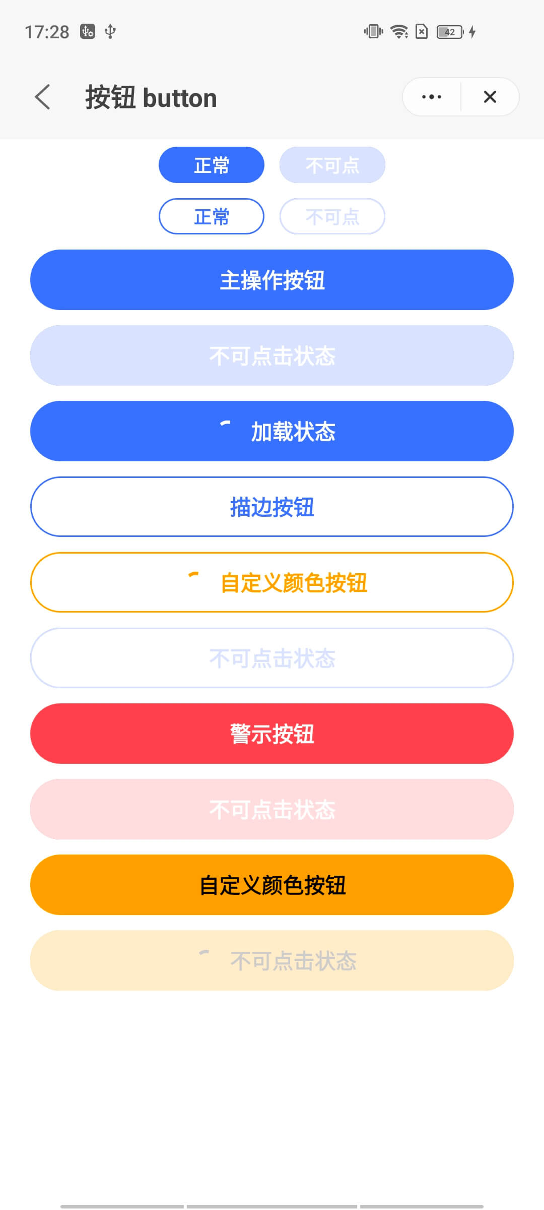
用于各类业务逻辑场景的基础组件。
# 使用效果
# 使用方法
在.ux文件中引入组件
<import name="q-button" src="qaui/src/components/button/index"></import>
1
# 示例
<template>
  <div class="qui-wrap">
    <div class="inline">
      <q-button class="button" type="primary" size="small">主操作按钮</q-button>
      <q-button class="button" type="primary" size="small" disabled="{{true}}"
        >主操作按钮</q-button
      >
    </div>
    <div class="inline">
      <q-button class="button" type="ghost" size="small">主操作按钮</q-button>
      <q-button class="button" type="ghost" size="small" disabled="{{true}}"
        >主操作按钮</q-button
      >
    </div>
    <q-button class="button" type="primary">主操作按钮</q-button>
    <q-button class="button" type="primary" disabled="{{true}}"
      >不可点击状态</q-button
    >
    <q-button class="button" type="primary" loading="{{true}}"
      >加载状态</q-button
    >

    <q-button class="button" type="ghost">描边按钮</q-button>
    <q-button class="button" type="ghost" color="orange" loading="{{true}}"
      >自定义颜色按钮</q-button
    >
    <q-button class="button" type="ghost" disabled="{{true}}"
      >不可点击状态</q-button
    >

    <q-button class="button" type="error">警示按钮</q-button>
    <q-button class="button" type="error" disabled="{{true}}"
      >不可点击状态</q-button
    >

    <q-button class="button" bg-color="orange" color="#000"
      >自定义颜色按钮</q-button
    >
    <q-button
      class="button"
      type="error"
      loading="{{true}}"
      bg-color="orange"
      color="#000"
      disabled="{{true}}"
      >不可点击状态</q-button
    >
  </div>
</template>
1
2
3
4
5
6
7
8
9
10
11
12
13
14
15
16
17
18
19
20
21
22
23
24
25
26
27
28
29
30
31
32
33
34
35
36
37
38
39
40
41
42
43
44
45
46
47
48
49
2
3
4
5
6
7
8
9
10
11
12
13
14
15
16
17
18
19
20
21
22
23
24
25
26
27
28
29
30
31
32
33
34
35
36
37
38
39
40
41
42
43
44
45
46
47
48
49
.qui-wrap {
  flex-direction: column;
  align-items: center;
  .button {
    margin: 5px;
  }
}
1
2
3
4
5
6
7
2
3
4
5
6
7
# API
# 组件属性
| 属性 | 类型 | 默认值 | 说明 |
|---|---|---|---|
| type | String | 'primary' | 按钮类型,可选值有 'primary'|'ghost'|'error' |
| size | String | 'normal' | 按钮大小,可选值有 'normal'|'small' |
| loading | Boolean | false | 按钮是否处于加载中 |
| disabled | Boolean | false | 按钮是否被禁用 |
| bgColor | String | '' | 按钮背景颜色 |
| color | String | '' | 按钮颜色(包括文字和边框) |
| width | Number | '' | 按钮宽度 |
# 组件事件
| 事件名称 | 事件描述 | 返回值 |
|---|---|---|
| tap | 按钮点击 | - |
← 图标 icon 容器 container →