# 模块标题 title
# 描述
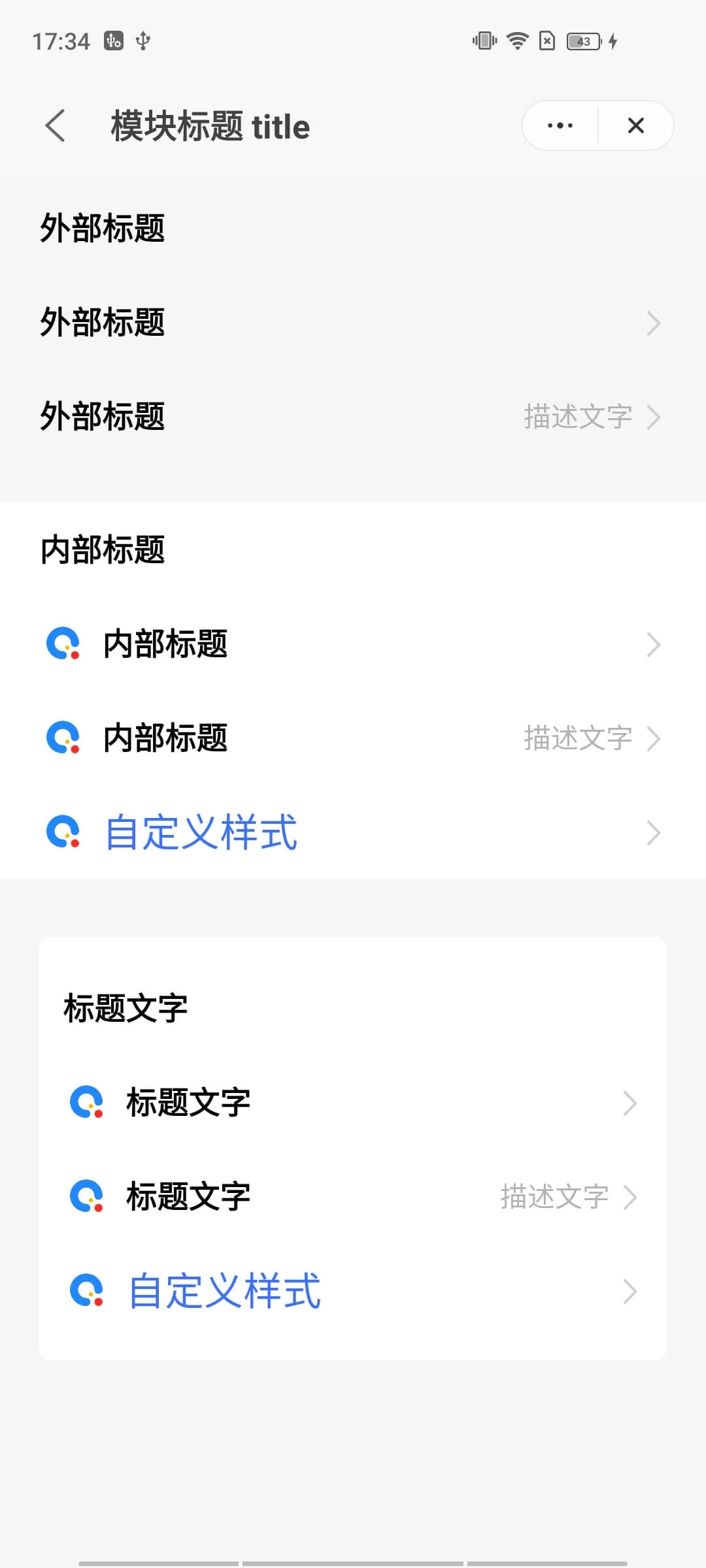
用来展示各级标题。
# 使用效果
# 使用方法
在.ux文件中引入组件
<import name="q-titlebar" src="qaui/src/components/title/index"></import>
1
# 示例
<div class="qaui-wrap">
  <div class="group">
    <q-title title="外部标题"></q-title>
    <q-title title="外部标题" target="/pages/home"></q-title>
    <q-title
      title="外部标题"
      description="描述文字"
      target="/pages/home"
    ></q-title>
  </div>
  <div class="group bg-white">
    <q-title title="内部标题"></q-title>
    <q-title
      icon="/common/logo.png"
      title="内部标题"
      target="/pages/home"
    ></q-title>
    <q-title
      icon="/common/logo.png"
      title="内部标题"
      description="描述文字"
      target="/pages/home"
    ></q-title>
    <q-title icon="/common/logo.png" target="/pages/home"
      ><text class="custom">自定义样式</text></q-title
    >
  </div>
  <q-container flex-direction="column">
    <q-title title="标题文字"></q-title>
    <q-title
      icon="/common/logo.png"
      title="标题文字"
      target="/pages/home"
    ></q-title>
    <q-title
      icon="/common/logo.png"
      title="标题文字"
      description="描述文字"
      target="/pages/home"
    ></q-title>
    <q-title icon="/common/logo.png" target="/pages/home"
      ><text class="custom">自定义样式</text></q-title
    >
  </q-container>
</div>
1
2
3
4
5
6
7
8
9
10
11
12
13
14
15
16
17
18
19
20
21
22
23
24
25
26
27
28
29
30
31
32
33
34
35
36
37
38
39
40
41
42
43
44
45
2
3
4
5
6
7
8
9
10
11
12
13
14
15
16
17
18
19
20
21
22
23
24
25
26
27
28
29
30
31
32
33
34
35
36
37
38
39
40
41
42
43
44
45
.qaui-wrap {
  background-color: #f6f6f6;
  flex-direction: column;
  .group {
    flex-direction: column;
    padding: 0 20px;
    margin-bottom: 20px;
  }
  .bg-white {
    background-color: #ffffff;
  }
  .custom {
    color: #456fff;
    font-size: 20px;
  }
}
1
2
3
4
5
6
7
8
9
10
11
12
13
14
15
16
2
3
4
5
6
7
8
9
10
11
12
13
14
15
16
# API
# 组件属性
| 属性 | 类型 | 默认值 | 说明 |
|---|---|---|---|
| title | String | '' | 标题文本 |
| icon | String | '' | 图标路径,支持网络图片 |
| description | String | '' | 描述文本 |
| target | String | '' | 点击跳转路径 |
# slot
| 名称 | 描述 |
|---|---|
| - | 自定义标题 |