# 多选按钮 checkbox
# 描述
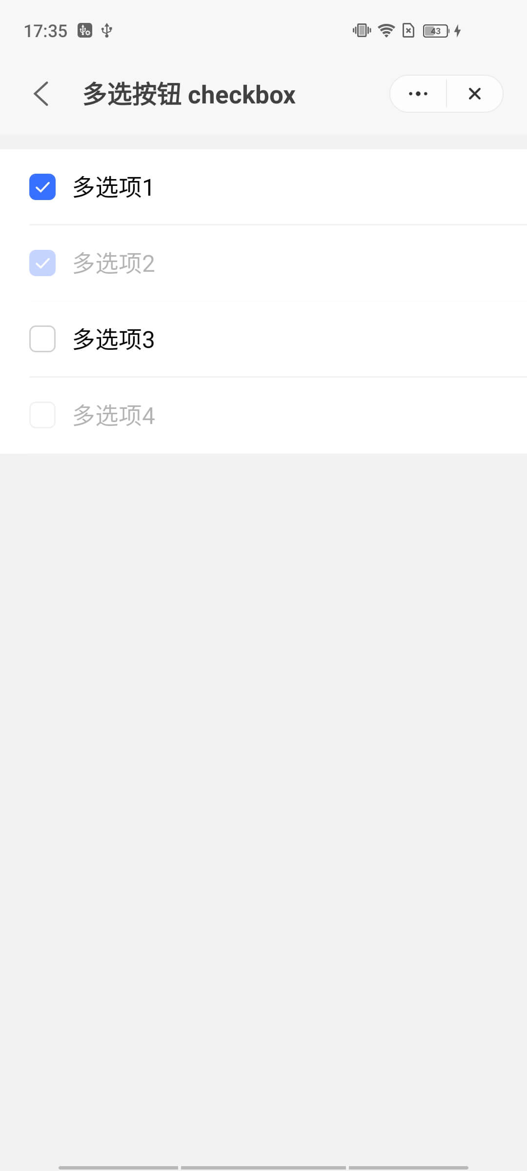
用于让用户在表单选择多个信息项。
# 使用效果
# 使用方法
在.ux文件中引入组件
<import name="q-checkbox" src="qaui/src/components/checkbox/index"></import>
1
# 示例
<template>
  <div class="qaui-wrap">
    <q-checkbox-group
      id="myGroup"
      current="{{current}}"
      onchange="handleChange"
    >
      <q-checkbox
        group="myGroup"
        type="list"
        for="{{list}}"
        value="{{$item.value}}"
        checked="{{$item.checked}}"
        disabled="{{$item.disabled}}"
      ></q-checkbox>
    </q-checkbox-group>
  </div>
</template>
1
2
3
4
5
6
7
8
9
10
11
12
13
14
15
16
17
18
2
3
4
5
6
7
8
9
10
11
12
13
14
15
16
17
18
export default {
  data() {
    return {
      list: [
        {
          id: 1,
          value: '多选项1',
          checked: true,
        },
        {
          id: 2,
          value: '多选项2',
          checked: true,
          disabled: true,
        },
        {
          id: 3,
          value: '多选项3',
        },
        {
          id: 4,
          value: '多选项4',
          disabled: true,
        },
      ],
      current: ['多选项2', '多选项1'],
    }
  },
  handleChange({ detail }) {
    const index = this.current.indexOf(detail.value)
    index === -1
      ? this.current.push(detail.value)
      : this.current.splice(index, 1)
  },
}
1
2
3
4
5
6
7
8
9
10
11
12
13
14
15
16
17
18
19
20
21
22
23
24
25
26
27
28
29
30
31
32
33
34
35
2
3
4
5
6
7
8
9
10
11
12
13
14
15
16
17
18
19
20
21
22
23
24
25
26
27
28
29
30
31
32
33
34
35
.qaui-wrap {
  flex-direction: column;
  align-items: center;
  background-color: #f2f2f2;
  padding: 10px 0;
}
1
2
3
4
5
6
2
3
4
5
6
# API
# 组件属性
| 属性 | 类型 | 默认值 | 说明 |
|---|---|---|---|
| checked | Boolean | false | 是否处于选中状态 |
| disabled | Boolean | false | 是否处于禁用状态 |
| value | String | - | 展示选项的值 |
| group | String | - | 多选框所在组的 id 值 |
# 组件事件
| 事件名称 | 事件描述 | 返回值 |
|---|---|---|
| change | 值发生变化的事件 | {current:current, value:value} |