# 通告栏 notice
# 描述
适用性广泛的通知栏,可用于通知的静态展示以及动态展示。
# 使用效果
# 使用方法
在.ux文件中引入组件
<import name="q-notice" src="qaui/src/components/notice/index"></import>
1
# 示例
<template>
  <div class="wrap">
    <div class="notice">
      <q-notice notice-text="{{ noticeTextArr[0] }}"></q-notice>
    </div>
    <div class="notice">
      <q-notice
        type="{{ typeArr[0] }}"
        notice-text="{{ noticeTextArr[1] }}"
        right-icon-type="{{ rightIconTypeArr[0] }}"
      ></q-notice>
    </div>
    <div class="notice">
      <q-notice
        type="{{ typeArr[1] }}"
        notice-text="{{ noticeTextArr[2] }}"
        right-icon-type="{{ rightIconTypeArr[0] }}"
      ></q-notice>
    </div>
    <div class="notice">
      <q-notice
        type="{{ typeArr[2] }}"
        notice-text="{{ noticeTextArr[3] }}"
        right-icon-type="{{ rightIconTypeArr[0] }}"
      ></q-notice>
    </div>
    <div class="notice">
      <q-notice
        type="{{ typeArr[2] }}"
        notice-text="{{ noticeTextArr[4] }}"
        right-icon-type="{{ rightIconTypeArr[1] }}"
        onlink-tap="linkTo"
      ></q-notice>
    </div>
    <div class="notice">
      <q-notice
        type="{{ typeArr[2] }}"
        notice-text="{{ noticeTextArr[5] }}"
        left-icon="{{ leftIcon1 }}"
        right-icon-type="{{ rightIconTypeArr[0] }}"
      ></q-notice>
    </div>
    <div class="notice">
      <q-notice
        type="{{ typeArr[2] }}"
        notice-text="{{ noticeTextArr[6] }}"
        left-icon="{{ leftIcon1 }}"
        right-icon-type="{{ rightIconTypeArr[1] }}"
        onlink-tap="linkTo"
      ></q-notice>
    </div>
    <div class="notice">
      <q-notice
        type="{{ typeArr[0] }}"
        notice-text="{{ noticeTextArr[7] }}"
        right-icon-type="{{ rightIconTypeArr[0] }}"
        right-icon="{{ rightIcon1 }}"
      ></q-notice>
    </div>
    <div class="notice">
      <q-notice
        type="{{ typeArr[0] }}"
        notice-text="{{ noticeTextArr[8] }}"
        right-icon-type="{{ rightIconTypeArr[1] }}"
        right-icon="{{ rightIcon2 }}"
        onlink-tap="linkTo"
      ></q-notice>
    </div>
    <div class="notice">
      <q-notice
        type="{{ typeArr[0] }}"
        notice-text="{{ noticeTextArr[9] }}"
        text-color="{{ textColor }}"
        bg-color="{{ bgColor }}"
        right-icon-type="{{ rightIconTypeArr[0] }}"
      ></q-notice>
    </div>
    <div class="notice">
      <q-notice
        type="{{ typeArr[0] }}"
        notice-text="{{ noticeTextArr[10] }}"
        right-icon-type="{{ rightIconTypeArr[0] }}"
        scrollable="{{ scrollable }}"
        scroll-times="{{ scrollTimes }}"
      ></q-notice>
    </div>
    <div class="notice">
      <q-notice
        type="{{ typeArr[0] }}"
        notice-text="{{ noticeTextArr[11] }}"
        left-icon="{{ leftIcon2 }}"
        right-icon-type="{{ rightIconTypeArr[0] }}"
        scrollable="{{ scrollable }}"
      ></q-notice>
    </div>
    <div class="notice">
      <q-notice
        type="{{ typeArr[0] }}"
        notice-text="{{ noticeTextArr[12] }}"
        left-icon="{{ leftIcon2 }}"
        right-icon-type="{{ rightIconTypeArr[1] }}"
        scrollable="{{ scrollable }}"
        speed="{{ speed }}"
        onlink-tap="linkTo"
      ></q-notice>
    </div>
    <div class="notice">
      <q-notice
        type="{{ typeArr[1] }}"
        notice-text="{{ noticeTextArr[13] }}"
        right-icon-type="{{ rightIconTypeArr[0] }}"
        scrollable="{{ scrollable }}"
      ></q-notice>
    </div>
    <div class="notice">
      <q-notice
        type="{{ typeArr[2] }}"
        notice-text="{{ noticeTextArr[14] }}"
        right-icon-type="{{ rightIconTypeArr[1] }}"
        scrollable="{{ scrollable }}"
        onlink-tap="linkTo"
      ></q-notice>
    </div>
    <div class="notice">
      <q-notice
        text-color="{{ textColor }}"
        bg-color="{{ bgColor }}"
        notice-text="{{ noticeTextArr[15] }}"
        right-icon-type="{{ rightIconTypeArr[1] }}"
        scrollable="{{ scrollable }}"
        onlink-tap="linkTo"
      ></q-notice>
    </div>
  </div>
</template>
1
2
3
4
5
6
7
8
9
10
11
12
13
14
15
16
17
18
19
20
21
22
23
24
25
26
27
28
29
30
31
32
33
34
35
36
37
38
39
40
41
42
43
44
45
46
47
48
49
50
51
52
53
54
55
56
57
58
59
60
61
62
63
64
65
66
67
68
69
70
71
72
73
74
75
76
77
78
79
80
81
82
83
84
85
86
87
88
89
90
91
92
93
94
95
96
97
98
99
100
101
102
103
104
105
106
107
108
109
110
111
112
113
114
115
116
117
118
119
120
121
122
123
124
125
126
127
128
129
130
131
132
133
134
135
import router from '@system.router'
export default {
data() {
return {
noticeTextArr: [
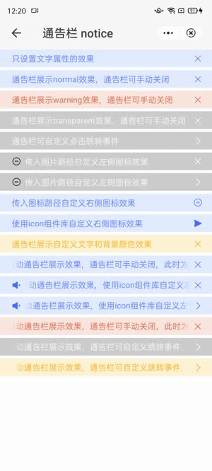
'只设置文字属性的效果',
'通告栏展示normal效果,通告栏可手动关闭',
'通告栏展示warning效果,通告栏可手动关闭',
'通告栏展示transparent效果,通告栏可手动关闭',
'通告栏可自定义点击跳转事件',
'传入图片路径自定义左侧图标效果',
'传入图片路径自定义左侧图标效果',
'传入图标路径自定义右侧图标效果',
'使用icon组件库自定义右侧图标效果',
'通告栏展示自定义文字和背景颜色效果',
'滚动通告栏展示效果,通告栏可手动关闭,此时为无限循环播放......',
'滚动通告栏展示效果,使用icon组件库自定义左侧图标,通告栏可手动关闭,此时为默认播放效果......',
'滚动通告栏展示效果,使用icon组件库自定义左侧图标,通告栏可自定义跳转事件,此时为自定义播放速度......',
'滚动通告栏展示效果,通告栏可手动关闭,此时为当type为warning的播放效果......',
'滚动通告栏展示效果,通告栏可自定义跳转事件,此时为当type为transparent的播放效果......',
'滚动通告栏展示效果,通告栏可自定义跳转事件,此时为自定义背景色和文字颜色的播放效果......',
],
typeArr: ['normal', 'warning', 'transparent'],
textColor: '#ffa500',
bgColor: '#fef3d5',
leftIcon1: {
iconPath: '/common/images/default_black.png',
},
leftIcon2: {
icon: {
type: 'volume-up-fill',
color: '#456FFF',
},
},
rightIconTypeArr: ['close', 'link'],
rightIcon1: {
iconPath: '/common/images/default_blue.png',
},
rightIcon2: {
icon: {
type: 'send-fill',
color: '#456FFF',
},
},
scrollable: true,
speed: 60,
scrollTimes: -1,
}
},
linkTo(data) {
const event = data.detail.event
console.log(event)
router.push({
uri: '/pages/button',
})
},
}
1
2
3
4
5
6
7
8
9
10
11
12
13
14
15
16
17
18
19
20
21
22
23
24
25
26
27
28
29
30
31
32
33
34
35
36
37
38
39
40
41
42
43
44
45
46
47
48
49
50
51
52
53
54
55
56
57
2
3
4
5
6
7
8
9
10
11
12
13
14
15
16
17
18
19
20
21
22
23
24
25
26
27
28
29
30
31
32
33
34
35
36
37
38
39
40
41
42
43
44
45
46
47
48
49
50
51
52
53
54
55
56
57
.wrap {
  flex-direction: column;

  .notice {
    margin-bottom: 5px;
  }
}
1
2
3
4
5
6
7
2
3
4
5
6
7
# API
# 组件属性
| 属性 | 类型 | 默认值 | 说明 |
|---|---|---|---|
| type | String | 'normal' | 通告栏类型,可选值有: 'normal' | 'warning' | 'transparent' |
| noticeText | String | '' | 通告栏文字 |
| textColor | String | '' | 自定义通告栏文字颜色 |
| bgColor | String | '' | 通告栏背景颜色,不建议使用 rgba,建议背景色为文字颜色乘以 0.15 透明度之后的 16 进制颜色值 |
| leftIcon | Object | {} | 左侧图标对象,具体说明见下方文档 |
| rightIconType | String | 'close' | 通告栏右侧按钮图标,可选值有: 'close' | 'link' |
| rightIcon | Object | {} | 右侧图标对象,具体说明见下方文档 |
| scrollable | Boolean | false | 是否滚动播放 |
| speed | Number | 20 | 滚动速度 |
| scrollTimes | Number | 5 | 滚动播放次数,当值为-1 时,则为无限滚动 |
leftIcon、rightIcon 属性对象的具体说明
| 属性 | 类型 | 说明 |
|---|---|---|
| iconPath | String | 图标路径,iconPath 和 icon 只需填写一个,如都填写,优先使用 icon |
| icon | Object | 组件库中 icon 组件配置项,目前只支持 type 和 color 两个属性 |
# 组件事件
| 事件名称 | 事件描述 | 返回值 |
|---|---|---|
| linkTap | 当 rightIconType 为'link'时,点击触发 | event |